

The Interconnection Measurement Project
Reporting Period: January 2018 – June 2024
The Internet is a network of networks connected by physical exchange points called interconnects. The Interconnection Measurement Project (IMP) described here reports on the overall utilization of interconnects from four participating Internet Service Providers (ISPs): Comcast, Charter, Cox, and Mediacom. The combined footprint of these four providers covers >75% of the United States population.
As we discuss in greater detail below, the key take-aways from this project are:
- Since January 2018, the overall interconnect utilization during times of peak traffic has stayed relatively constant at around 30-40%.
- The highest utilization percentage of 41% was seen during the beginning of the first COVID-19 surge in spring 2020. Since mid-2021, interconnect utilization has remained between 28-35% during times of peak traffic.
- These utilization percentages have stayed constant even as the total amount of ingress traffic has increased. This is due to ISPs proactively increasing interconnect capacities to scale with the increase in traffic.
- The majority (around 70%) of interconnects are never more than 50% utilized.
- Furthermore, less than 0.1% of monthly internet traffic is being sent on interconnects experiencing >95% utilization.
Key Terms
- Internet Service Provider (ISP): A provider offering end-user Internet access; they are sometimes also referred to as an ‘access network provider’ or ‘last mile provider’.
- Interconnect / Interconnection Point: The physical link that connects two networks together in the Internet ecosystem.
- Interconnection Capacity: The amount of data that can traverse an interconnection point per unit of time (bits per second).
- Interconnection Utilization: A ratio of the amount of data traversing an interconnection point compared to that interconnection’s total capacity.
- Peak Usage / Peak Traffic: Consistent with industry practice, peak usage is defined as the 95th percentile of interconnect utilization measurements.
- Ingress Data: Data being downloaded (as opposed to egress data / data being uploaded).
Changes in Interconnect Utilization Over Time
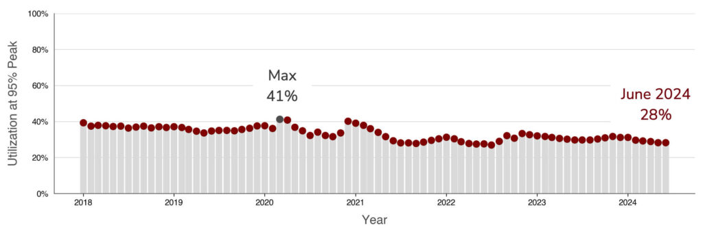
Figure 1: Monthly Interconnect Utilization During Times of 95% Peak Traffic.
Overall, interconnect utilization during times of peak traffic has stayed relatively constant at around 30-40%. Notable increases include the beginning of the COVID-19 pandemic in spring 2020, as well as the COVID-19 Omicron wave in the winter of 2020/2021.
To get a better sense of the overall distribution of interconnect utilizations, and not just during times of peak traffic, we can switch from a monthly view to the yearly view below.
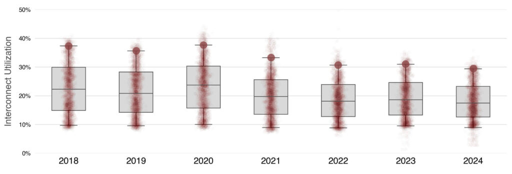
Figure 2: Yearly Distributions of Interconnect Utilizations.
This visualization shows the yearly distribution of interconnect utilizations with accompanying box-and-whisker plots. The line in the middle of the grey box shows the year’s median value while the two whiskers are at the 5th and 95th percentile values. The 95th percentile value on each box-and-whisker plot, which has been highlighted with a large red circle, is the value that was plotted on a monthly basis in Figure 1. This figure highlights that as the interconnect utilizations during times of peak traffic vary between 30-40%, the median utilizations vary between 15-25% with a similar range of values each year.
Changes in Ingress Traffic and Capacity Over Time
While the interconnect utilizations have stayed relatively constant, the total amount of ingress traffic on each interconnect has steadily increased.
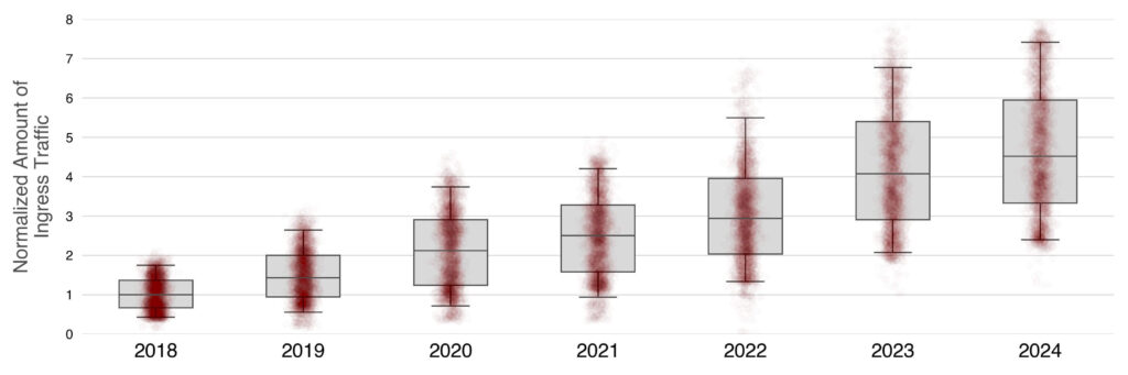
Figure 3: Yearly Distributions of Ingress Traffic.
The visualization above shows the yearly distribution of ingress traffic on the interconnects again with box-and-whisker plots (whiskers at 5th and 95th percentile values). The ingress traffic values have been normalized to the 2018 median value. Therefore, since 2018, the median amount of ingress traffic on an interconnect increased by a factor of 4.5. Additionally, the overall range of the amount of ingress traffic on each interconnect also increased.
Figures 2 and 3 show that as the amount of traffic on each interconnect increased, the total interconnect utilizations stayed constant. As is shown below in Figure 4, these fairly constant utilizations highlight the ISPs’ work to proactively increase interconnect capacity over time, and especially during the peak of the COVID-19 pandemic.
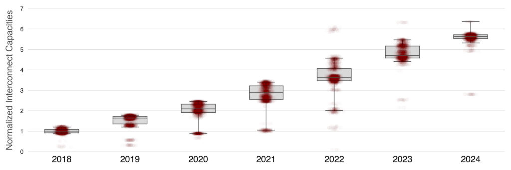
Figure 4: Yearly Distributions of Interconnect Capacities.
This visualization shows the yearly distribution of interconnect capacities again with box-and-whisker plots (whiskers at 5th and 95th percentile values). The interconnect capacity values have again been scaled to the 2018 median value. While the range of interconnect capacities was relatively small in 2018 and 2019, it increased in 2020, 2021, and 2022 as interconnects were upgraded to higher capacities. Since 2023 the distribution of interconnect capacities has continued to decrease and now almost all interconnect capacities are almost six times larger than what they were in 2018. This is in contrast with the factor of 4.5 increase in ingress traffic measured since 2024 (shown in Figure 3) and suggests that many interconnects have high capacities but low utilizations.
Highly Utilized Interconnects
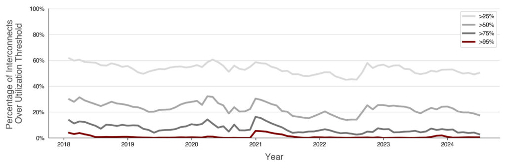
Figure 5: Percentage of Interconnects With Greater Than 25%, 50%, 75%, and 95% Utilization for >5% of a Month.
To better understand how often interconnects reach various utilizations, we can examine Figure 5. It shows that the vast majority of interconnects (>70%) are less than 50% utilized for >5% of a month. It additionally shows that, with the exception of the COVID-19 Omicron Wave in winter 2020/2021, only a couple percent of interconnects had >95% utilization for >5% of a month. It is important to note that the exact relationship between interconnect utilization and a user’s experience is an active area of research and a 95% utilization does not necessarily indicate a poor user experience. Besides just the interconnect utilization, a user’s experience depends on a range of factors such as in-home networking, how an application is developed, and client devices. Additionally, the largest interconnections for ISPs are typically application specific, allowing application developers flexibility in how they send traffic based on internal quality of experience measures.
In Figure 5, the percentage of interconnects at the various utilization thresholds is not weighted by capacity. Thus, a 10-Gigabit interconnect is counted the same as a 100-Gigabit interconnect even though they have a different relative importance on the network. To better understand the amount of traffic being sent over a highly utilized interconnect, we can look at Figure 6 below.
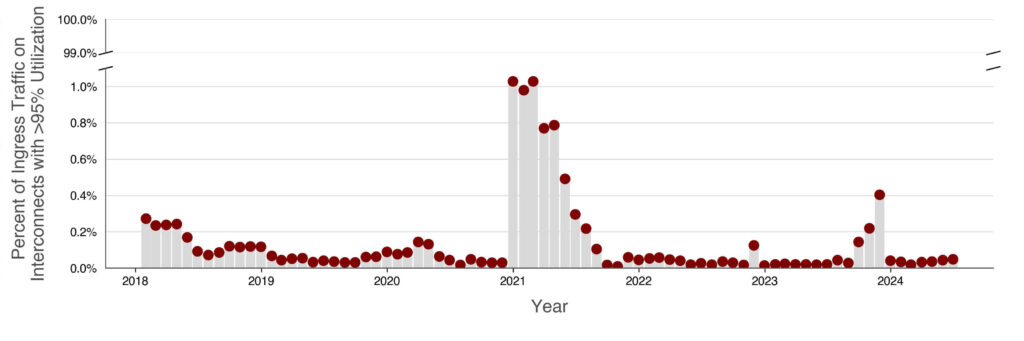
Figure 6: Ingress Traffic Being Sent Over Highly Utilized Interconnects.
This view shows the amount of monthly ingress traffic being sent over an interconnect that is >95% utilized. Again, this high utilization amount does not necessarily indicate a poor quality of experience for the user. With the exception of the winter 2020/2021 Omicron peak and the first half of 2021, only around 0.1% of overall internet ingress traffic was sent on interconnects with >95% utilization.
Overall, the IMP dataset and resulting visualizations point to the ISP’s ability to proactively increase interconnect capacities to stay ahead of increasing network traffic.
Further Information About The Data
To make the visualizations above, the participating ISPs provided data collected using both the NetFlow and SNMP protocols. These datasets contain the total amount of ingress data (in bytes) on each interconnect over a 5 minute period as well as the interconnect’s total capacity (in bytes). Using these values alongside basic outlier-removal and data-cleaning methods, we can determine the total utilization across all interconnects as well as the time this peak occurred. Peak utilization across all interconnects was determined using a “peak of sums” approach as opposed to a “sum of peaks” approach. For an overview on historical methodology, see Revealing Utilization at Internet Interconnection Points. If you have further questions about our data cleaning and/or analysis process, please reach out to us directly.
Note: Previously, we provided region-specific views of the interconnect utilization over time. If those visualizations would be of use, please reach out to us directly.